Color is one of the most immediate and emotional elements of brand identity. Before someone reads your tagline or explores your site, they’ve already absorbed a mood and made a first impression. That’s the power of color psychology in branding. It works fast, it works subconsciously, and it can either pull someone in or push them away.
Choosing your brand colors isn’t just an aesthetic decision. It’s a strategic choice that affects how people feel, trust, and remember your business. But too often, color palettes get picked because they “look nice” or follow trends, not because they reflect brand personality or positioning.
In this post, we’ll explore what different colors communicate, how to choose a palette that fits your brand voice, and why color psychology is one of the most overlooked tools in building brand trust.
Why color matters in branding
Color isn’t just visual. It’s psychological. Different hues create different emotional responses and those responses shape how people perceive your brand.
Warm tones often feel bold and energetic. Cool tones can signal calm, professionalism, or depth. Neutrals create space and sophistication. But none of these are good or bad on their own. What matters is how your colors align with the message and tone your brand is trying to communicate.
A bold startup might use red to signal energy and urgency. A wellness brand might use sage green to evoke calm and renewal. An elevated tech company might lean on deep navy and charcoal for sophistication and trust. Every choice sends a signal whether it’s intentional or not.
Color influences perception before language does. It’s often the first cue people get about who you are.
Common colors and their brand associations
Red
Often associated with passion, urgency, power, and appetite. Red can create a sense of movement or intensity. Use it carefully. A little goes a long way.
Red brands tend to be assertive, energetic, or emotionally charged.

Blue
Trusted, professional, and calm. Blue is the most commonly used corporate color for a reason. It’s reliable and versatile.
Blue conveys trust, intelligence, and dependability.

Green
Represents growth, wellness, balance, and nature. It can feel soothing or vibrant depending on the shade.
Green brands often center around health, sustainability, or renewal.

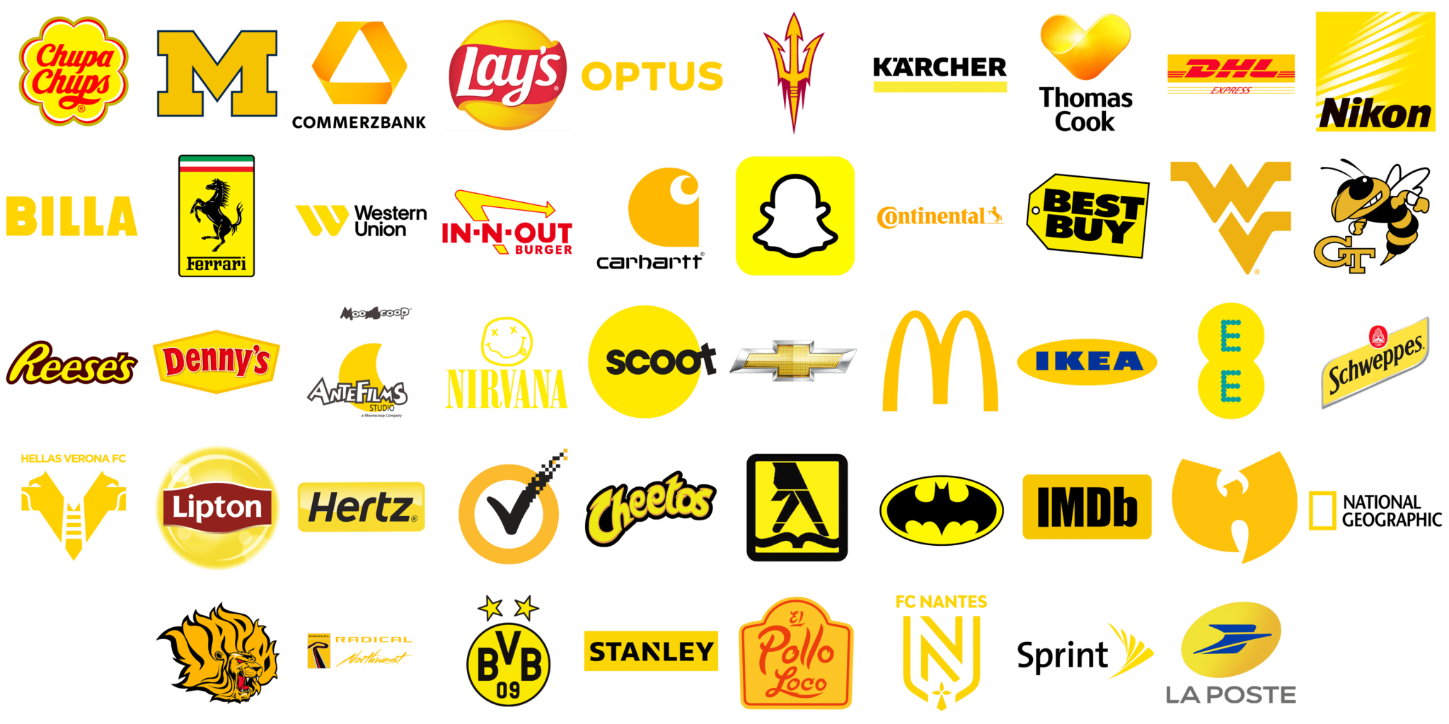
Yellow
Joyful, optimistic, and stimulating. It grabs attention but can be overwhelming if overused.
Yellow signals creativity, youthfulness, and energy.
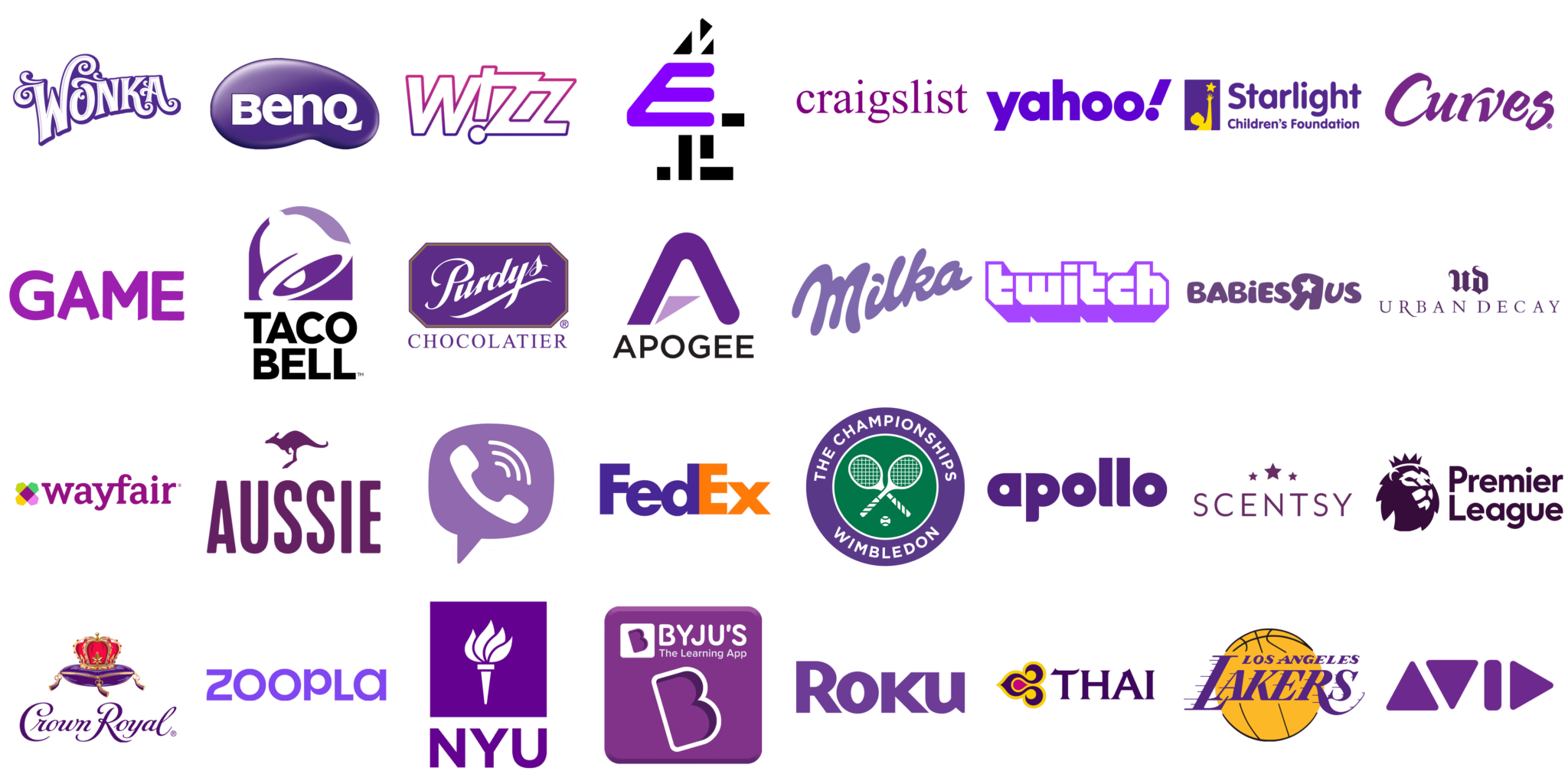
Purple
Historically tied to luxury and mysticism. Purple feels bold and unique, especially in digital and beauty spaces.
Purple brands often want to feel elevated, artistic, or unconventional.
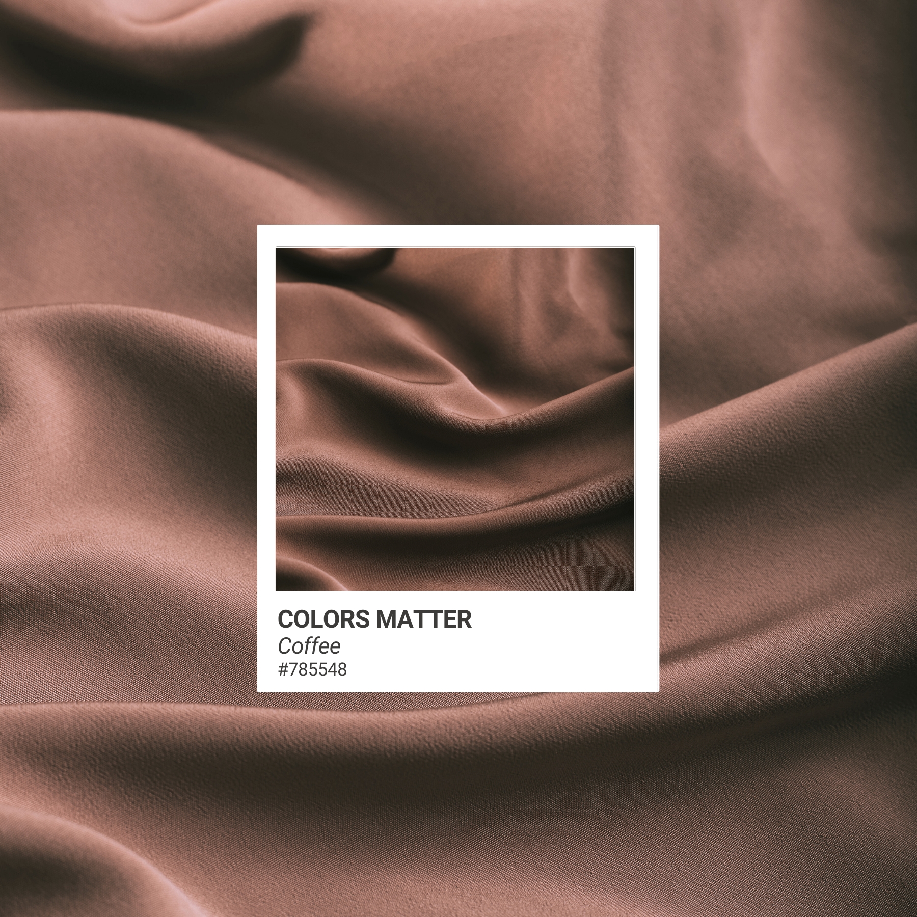
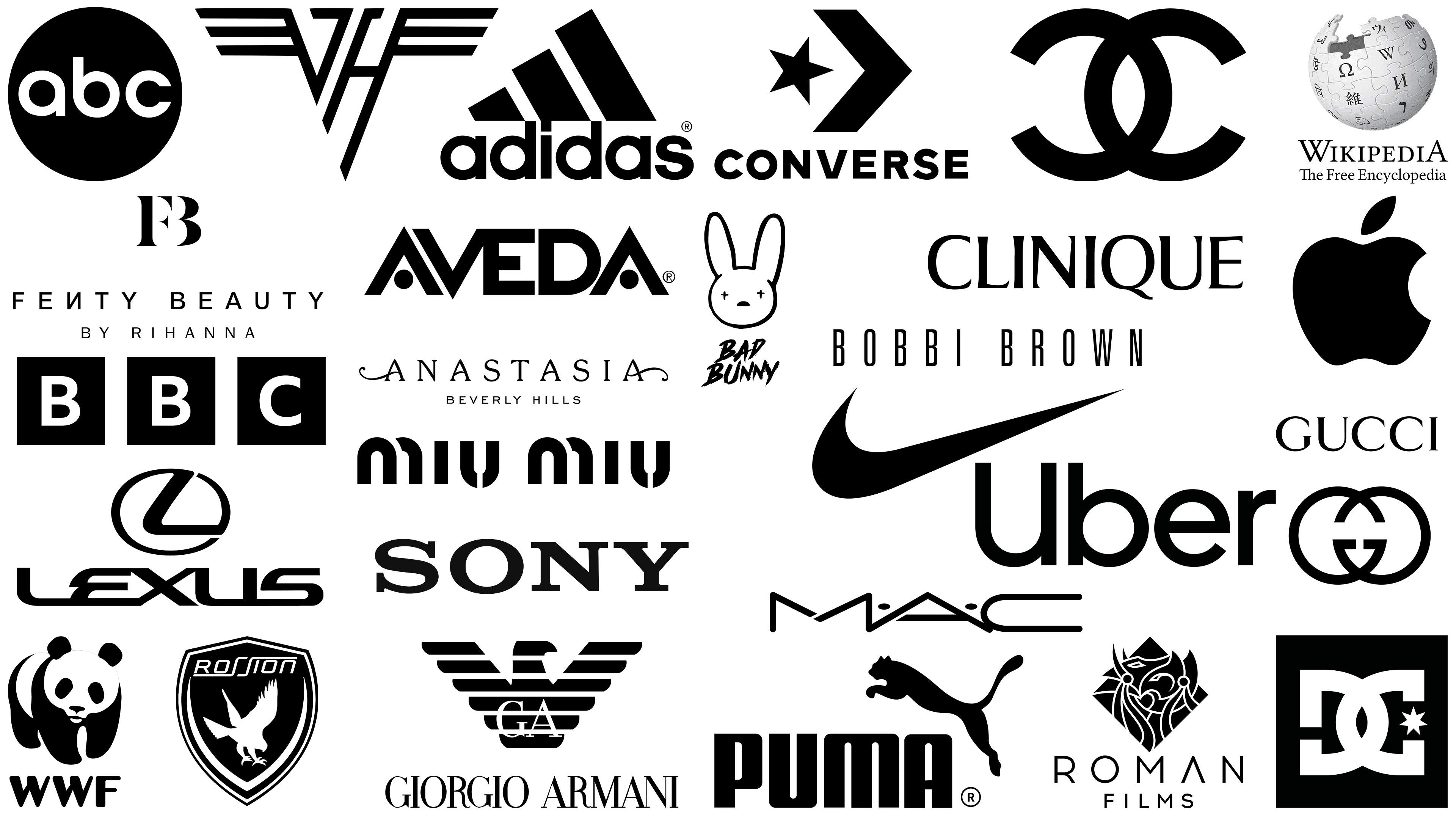
Black & Neutrals
Minimal, timeless, and refined. These tones help other colors shine or act as a grounding force.
Neutrals support a premium, structured, or editorial brand feel.
How to choose a color palette that fits
Start with your brand strategy. What are you trying to express? Who are you trying to connect with? Your colors should reinforce the emotions you want your audience to feel when they interact with your brand.
Consider the industry landscape, but don’t copy it. If every competitor uses the same tones, going against the grain can be a strategic differentiator as long as it still aligns with your brand personality.
Think in systems, not single colors. You’ll likely need a primary, secondary, and supporting palette that work together across platforms. Make sure your colors are usable in digital, print, and packaging. Test accessibility and contrast. And don’t forget how color shows up emotionally, not just aesthetically.
What your brand palette might be saying (without words)
If your brand colors feel off, outdated, or disconnected from your voice, they might be working against you. Here are a few signals to watch for:
- Muted, washed-out tones that don’t match a bold tone of voice
- Harsh contrasts that overwhelm delicate, welcoming messaging
- Trendy palettes that no longer align with your evolved offer
- Too many colors creating visual chaos instead of cohesion
Your color palette should reinforce your brand’s story, not compete with it. When color and copy speak the same language, your brand becomes unforgettable.
Need help translating brand voice into color?
At A Brand Above, we don’t choose colors for aesthetics alone. We build visual systems rooted in psychology, voice, and brand strategy so every tone tells the right story.
If you’re launching a new brand or evolving an old one, we’ll help you build a palette that works hard behind the scenes and holds up in the long run.
Read more insights