Every founder wants a brand identity that feels timeless. But most end up with something that goes stale in two years. Or worse, something that never quite felt right to begin with.
So what makes a brand identity actually timeless? It’s not about stripping your visuals down to something boring. It’s not about staying neutral or “safe.” And it’s definitely not about mimicking big brands or whatever’s trending in your industry.
A timeless brand identity is strategic, adaptable, and deeply aligned with your business. It grows with you. It tells the truth about who you are. And it holds up in two years, ten years, or whenever your next big move comes.
In this article, we’re breaking down the anatomy of a brand identity that lasts. Not one that looks good today. One that’s built to evolve, stay recognizable, and keep earning trust over time.
What makes a brand identity timeless?
Let’s start here: timeless doesn’t mean trendless. It means rooted in something more enduring than design trends. The best brand identities evolve naturally because they’re anchored to strategy, not aesthetics alone.
A timeless identity has a few things in common. It’s consistent but flexible. It’s clear but layered. And most importantly, it’s built on an understanding of how your brand shows up and speaks to people, not just how it looks.
If you’re designing a brand for long-term growth, you’re not just creating a logo or choosing a typeface. You’re building a system that can scale with your content, campaigns, website, packaging, team, and future ambitions. That takes more than taste. It takes strategy, structure, and real brand self-awareness.
Why most brands get it wrong
Most brands miss the mark because they start with visuals instead of foundations.
They skip strategy and jump into moodboards. They chase inspiration but ignore business goals. They over-design or under-define. And when things stop feeling aligned, they patch over the brand with a quick refresh rather than revisiting the deeper identity.
Without clear strategy and structure, even a beautiful brand won’t feel timeless. It’ll feel off. Unrooted. Out of sync. And worst of all, forgettable.
The six elements of a timeless brand identity
Let’s walk through what actually makes up a strategic, sustainable brand identity. These aren’t just design ingredients. They’re interconnected elements that, together, form a brand system that works.
1. Strategy-first foundation
Before design begins, your brand needs a strategic core. That includes your business goals, audience, positioning, messaging, and long-term vision. Your identity should reflect who you are and where you’re going; not just what looks good right now.
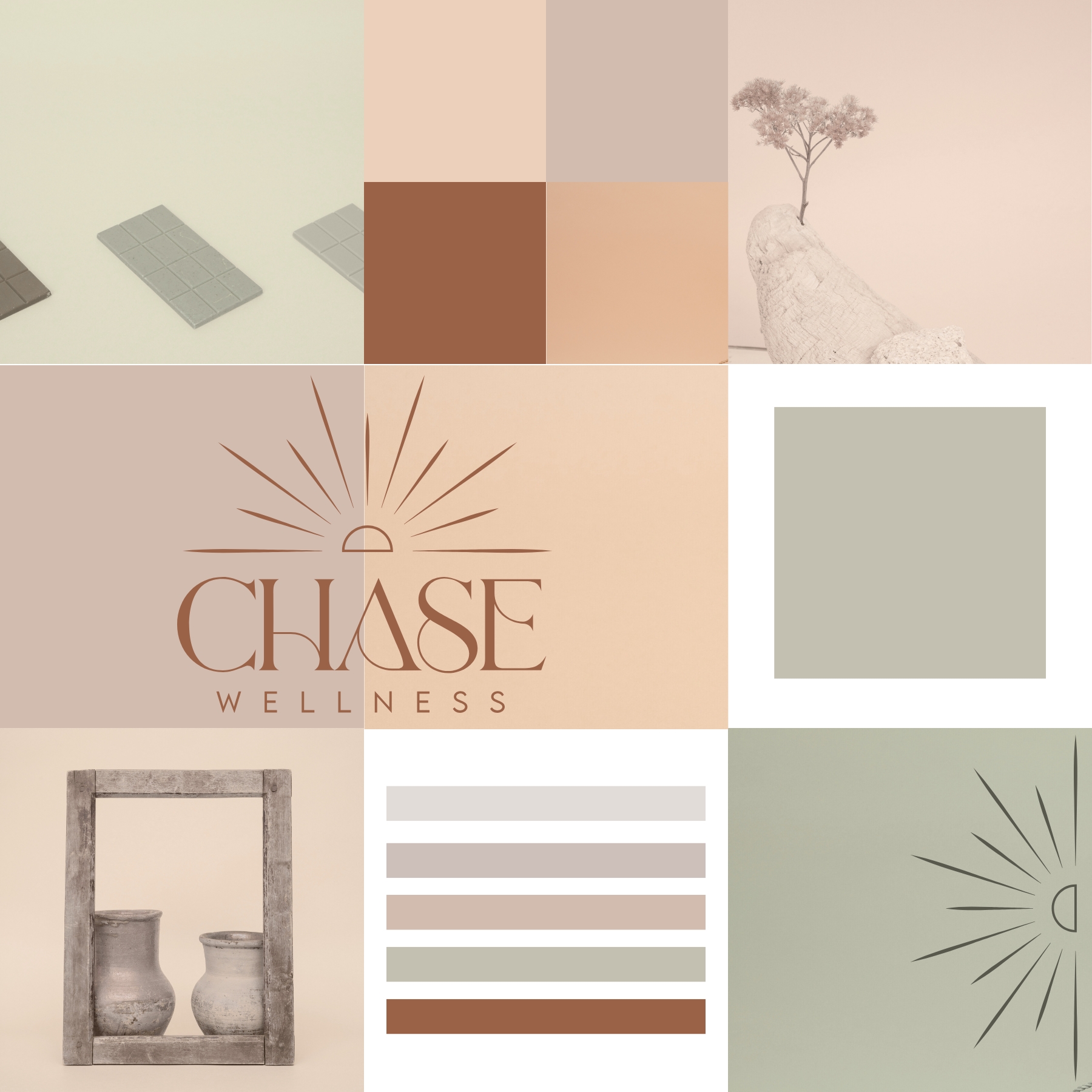
2. A flexible logo system
A timeless brand rarely relies on one logo alone. Instead, it uses a primary mark, secondary options, icons, and responsive variations that adapt across print, web, and product. Flexibility is what makes your logo system sustainable, not just beautiful.
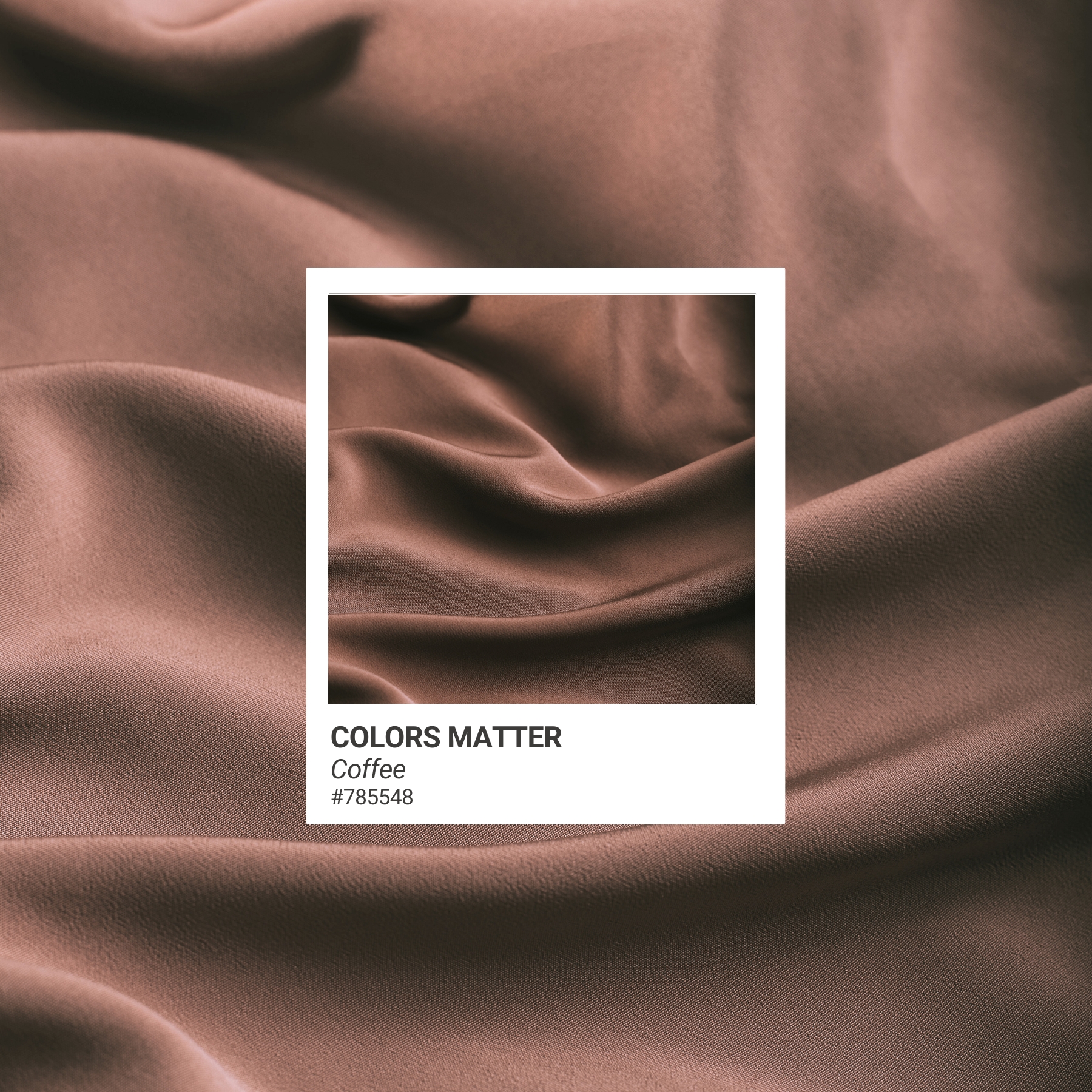
3. A deliberate color palette
Trendy colors come and go. But a timeless palette is chosen based on brand emotion, tone, and usability. It should support your messaging, work across mediums, and allow room for sub-palettes or seasonal extensions over time.
4. Typography that earns its place
Type is the invisible power of your identity. It shapes the tone of every word. Timeless brands use type intentionally, balancing legibility, character, and hierarchy. It’s less about picking the “coolest” font and more about consistency and restraint.
5. Visual consistency, not rigidity
You don’t need rigid design rules. You need smart systems. Timeless brands don’t look the same in every execution, but they do feel the same. That consistency builds recognition. And that’s what builds trust.
6. Brand voice and visuals in sync
A brand identity is more than visuals. It’s how your brand sounds, speaks, and behaves. Your copy should reflect the same tone your design sets. If your visuals say minimal and elegant but your messaging is playful or chaotic, your audience will feel the disconnect, even if they can’t name it.
What timeless doesn’t mean
Let’s be clear. Timeless doesn’t mean boring. It doesn’t mean stripped of personality. And it definitely doesn’t mean invisible.
A timeless brand can still be bold. Still have character. Still show up in a modern way. The difference is, it doesn’t lean on short-term trends to stay relevant. It’s designed to scale with your business and stand out for the right reasons.
The goal is a brand identity that grows with you, not one you outgrow.
So how do you know if your brand identity is built to last?
Ask yourself:
- Does it feel like you?
- Can it adapt to new platforms or offerings?
- Is it easy to use, share, and expand across content types?
- Does it align with your audience and business goals?
- Does it still feel relevant a year after launch?
If not, the issue isn’t your logo. It’s your structure. And the good news is, that can be fixed without starting over from scratch.
Need help building a brand that lasts?
At A Brand Above, we don’t do trendy for the sake of trendy. We help businesses build strategic brand identities that grow with them, not against them.
If you’re launching something new, evolving your brand, or rethinking your direction, we’ll help you build a system that reflects your next chapter and holds up for the long haul.
Read more insights